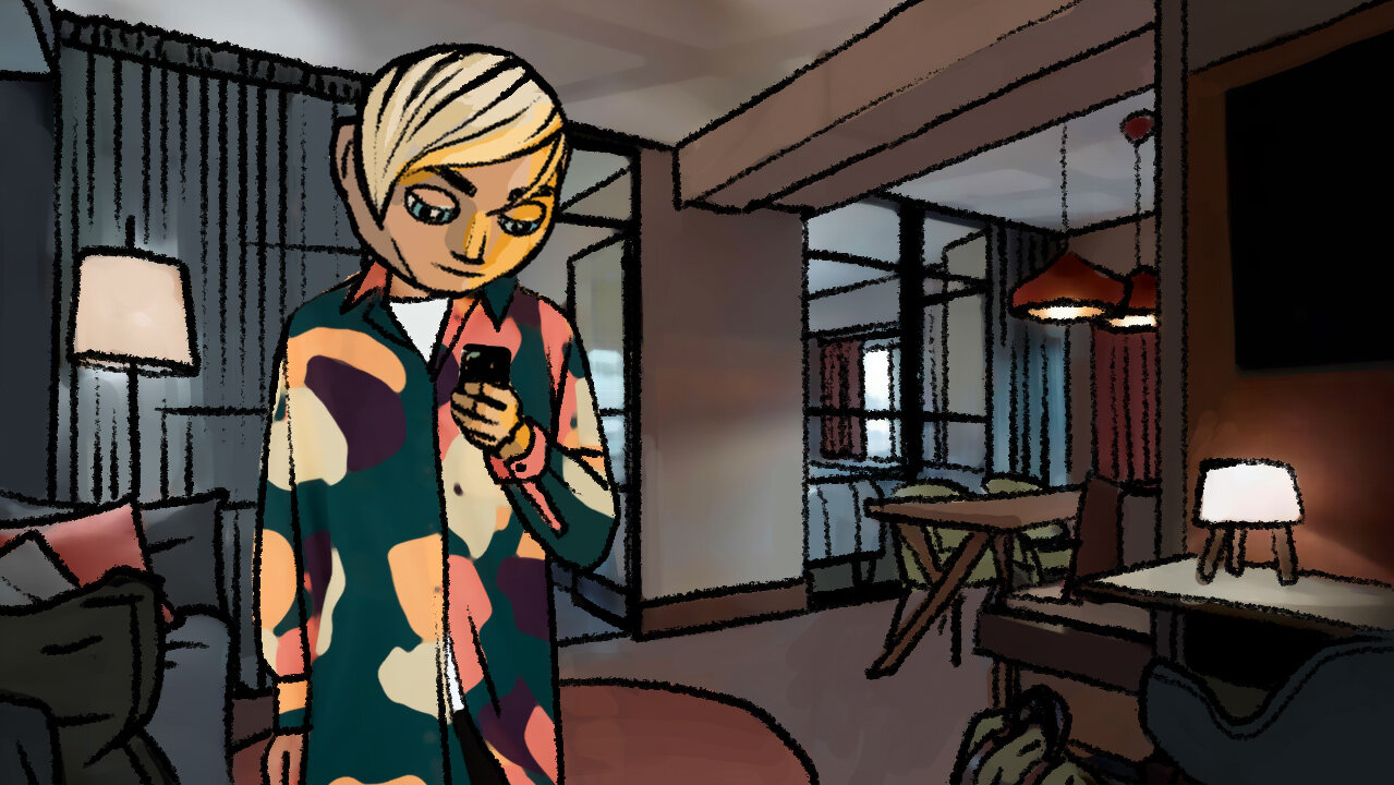
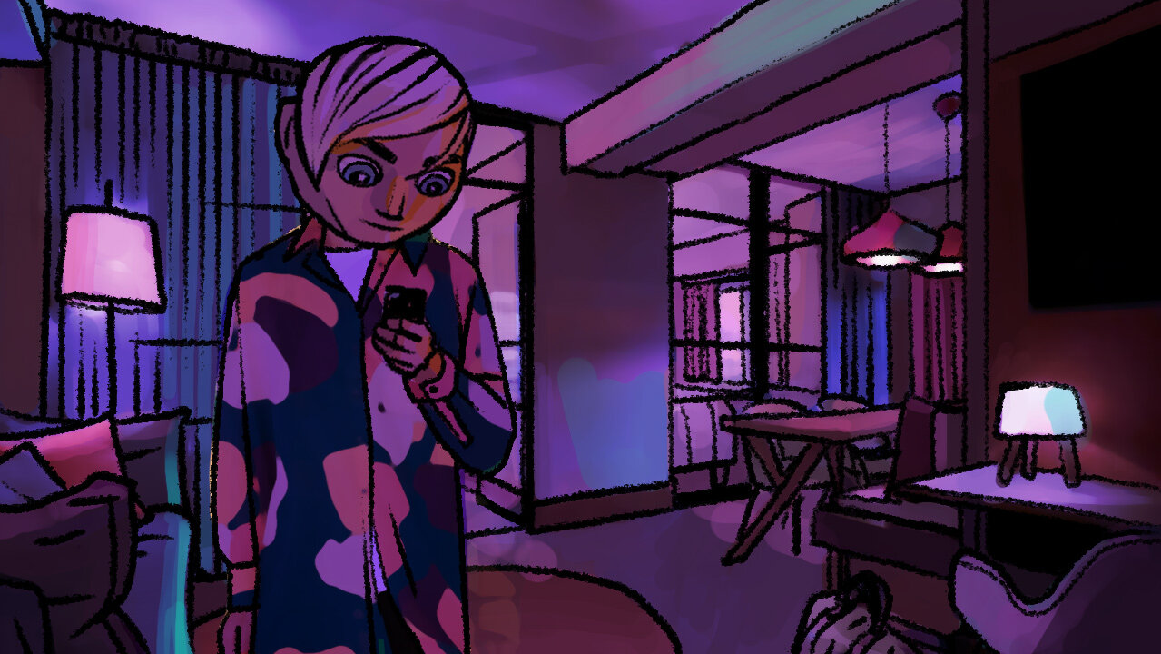
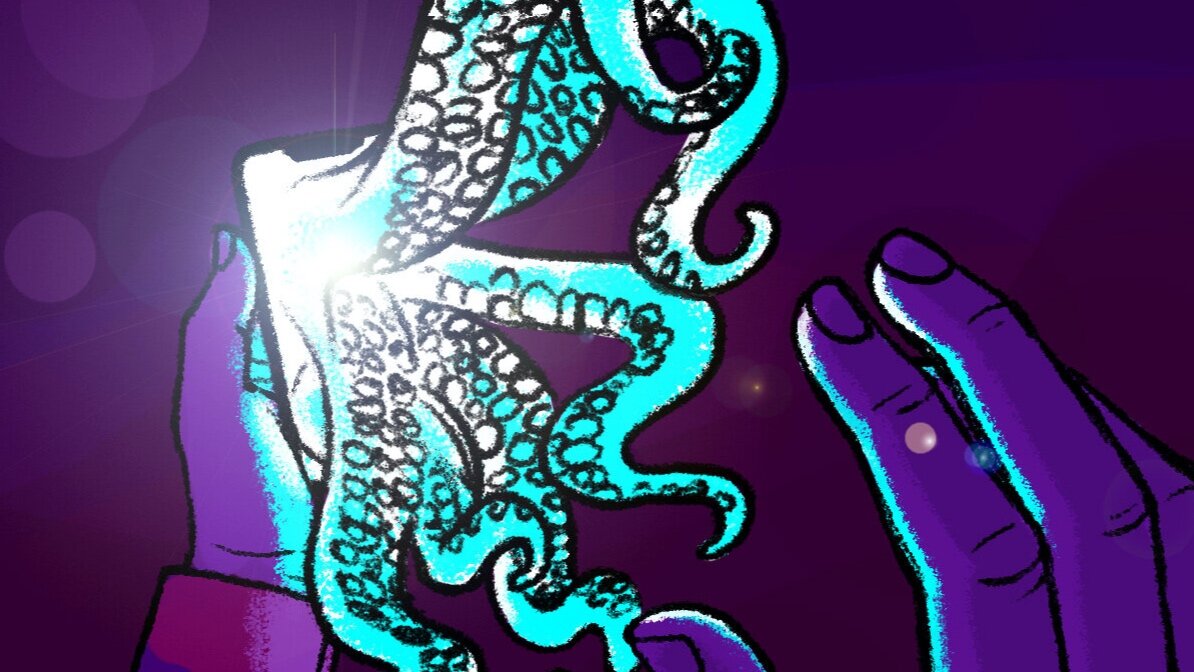
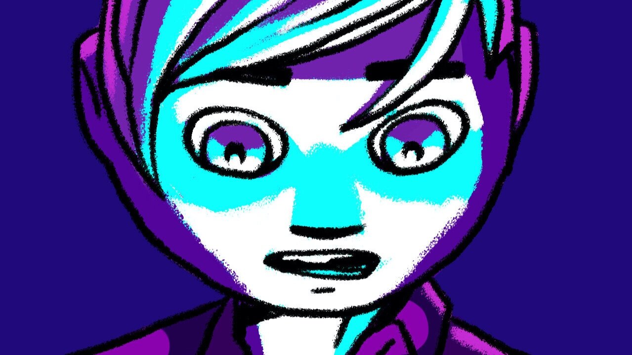
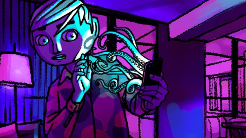
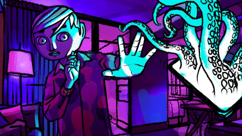
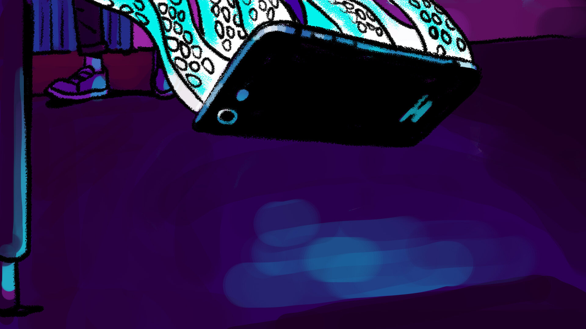
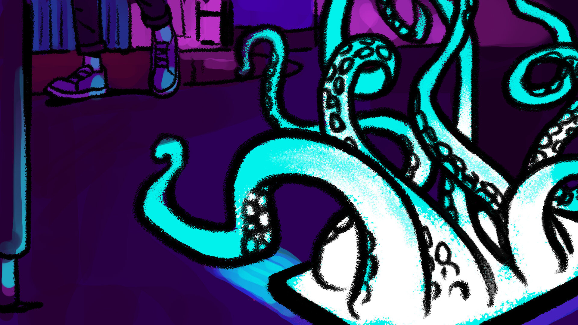
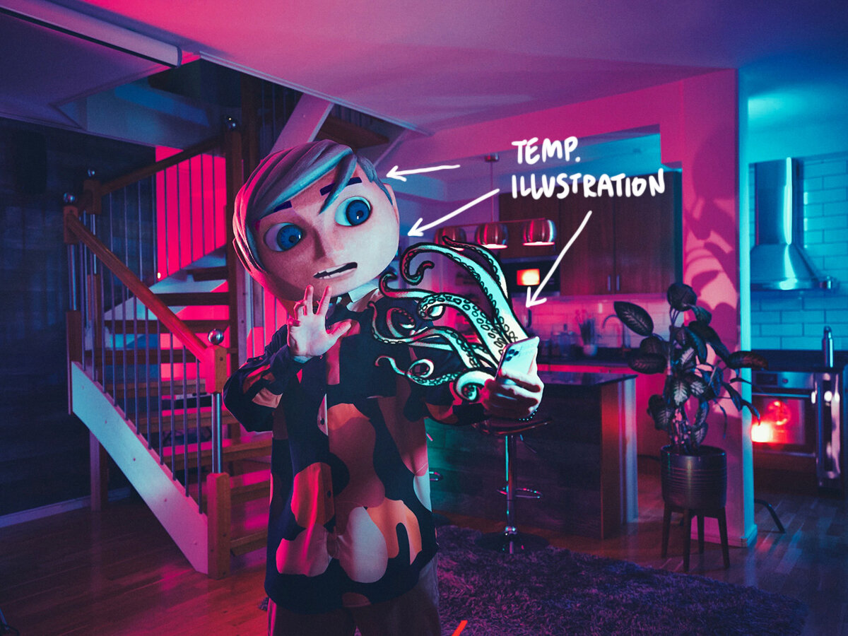
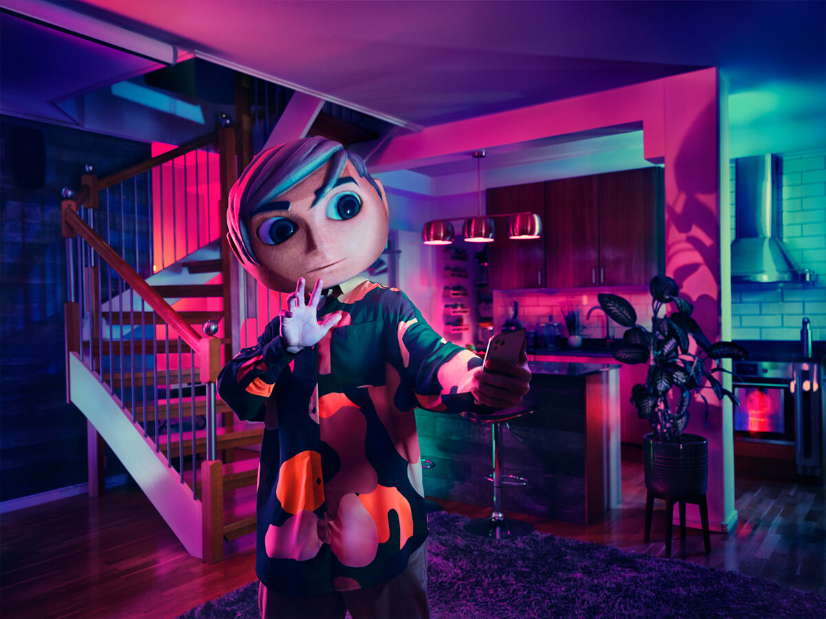
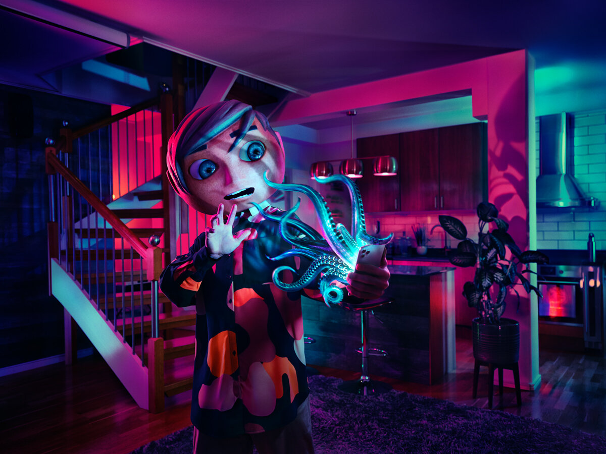
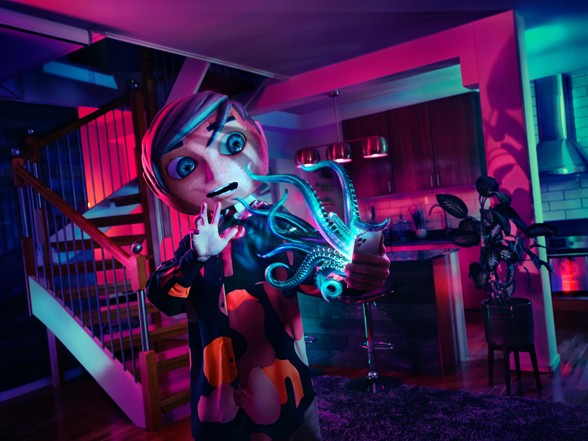
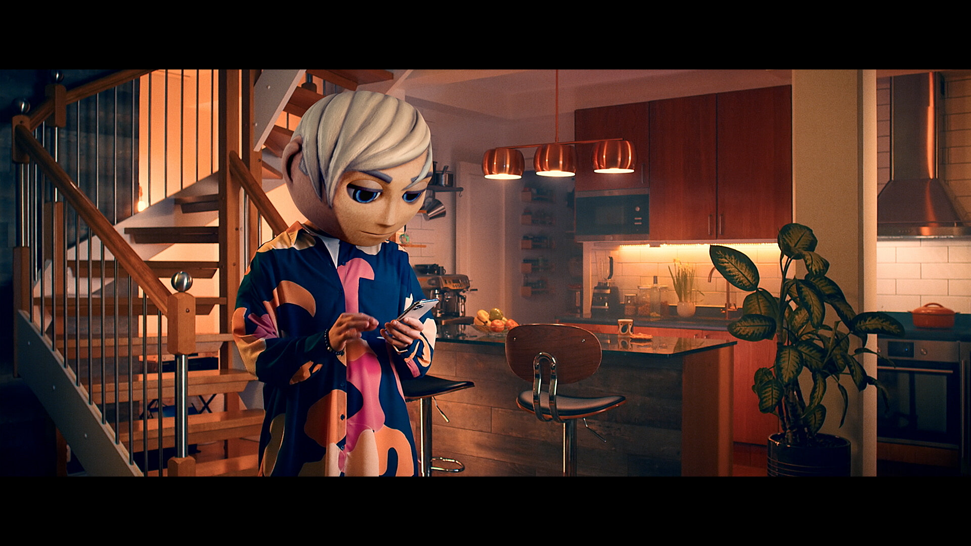
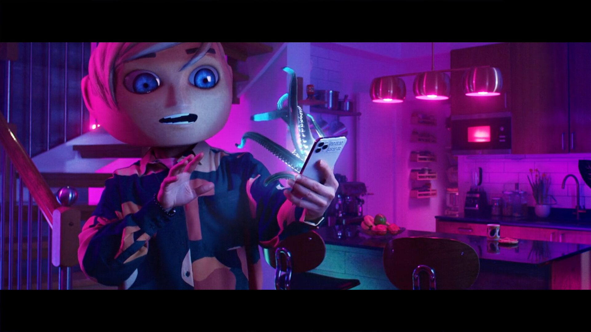
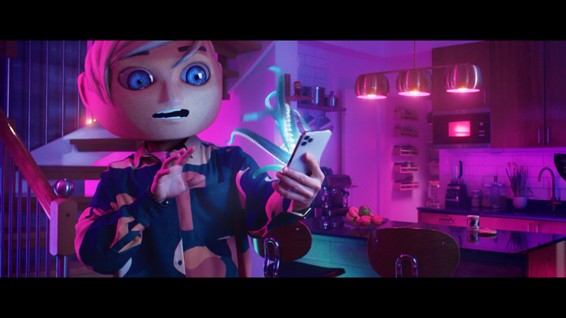
To attract attention and give impact to a serious – but very low key – problem we needed to make the villain more threatening. Anxiety and fear of incoming calls being regarded by many with skepticism didn’t help. The phone being small and the incoming call being (close to) invisible didn’t make things easier either. We toyed with the idea of making the actual phone look scary, but it was still small and didn’t read well. Also, the phone is not the villain, most people love their phone, they just don’t like incoming calls. So we needed to find a story and a visual that allowed us to portray this love/hate relationship. And to do it in a way that grabbed everyone’s attention.
Time to zoom in on the Bad Guy – the incoming call – and dismantle remarks like WTF, Just pick it up, Snowflake generation, etc.
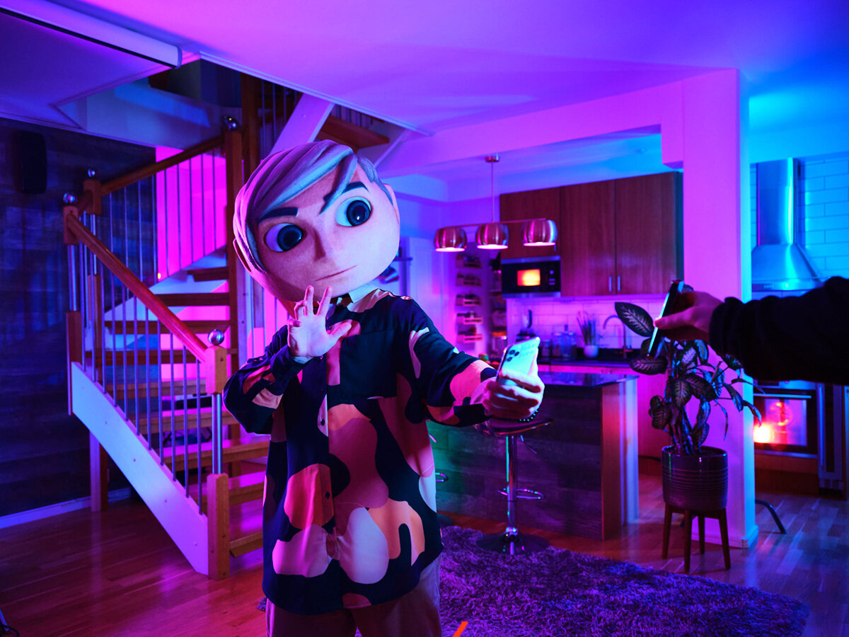
The close-ups below contain my three favorite details in this photo. I love the way the naked light bulb behind the stairs add depth and enrich the overall palette. I love the way the hair is carved out by the rim light and I love the way we lit the big plant from below to cast eerie and menacing shadows on the column behind it. Details yes, but at the same time very conscious choices that affect both impact and storytelling.
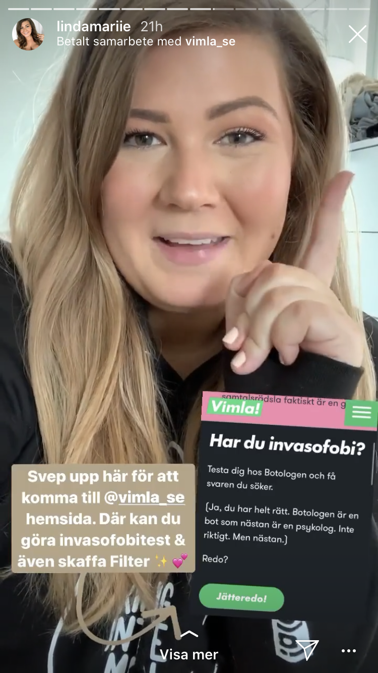
Video ads ran on all sorts of platforms and on vimla.se we had a Chatbot Psychologist that told you if – and to what extent – you were suffering from invasophobia.
I had a very clear idea of what the visuals needed to look like, but it took a lot of work to get there. I’m eternally grateful for the patience of Photographer Patrik Lindén and 3D-artist Simon Karlsson who put their hearts and souls into this.
For maximum impact, I wanted to create a sense of horror that was surreal and operatic. More along the lines of Dario Argento’s Suspiria (1977) than contemporary horror movies like Hostel, Insidious, or The Conjuring.
Superfluous eye-candy some might say. Absolutely essential eye-protein I’d say. The personality, impact, and attitude that’s embedded in the look is such a big part of the Brand ID, which makes all investments in media (attention, recognition, recall) give so much more in return. Below are some of my early explorations in operatic lighting. The green palette was scrapped pretty early even though it looks good. We didn’t want to link the brand color to the antagonist.
The finished photo and TVC stayed surprisingly close to the early storyboard I did below.
Location scouting was tough, since we were a skeleton crew with limited resources in time and budget. We needed a place with a lot of depth and different angles and corners that would allow the colored lights to sculpt the room. In the end we found a place with columns and nooks that worked really well.
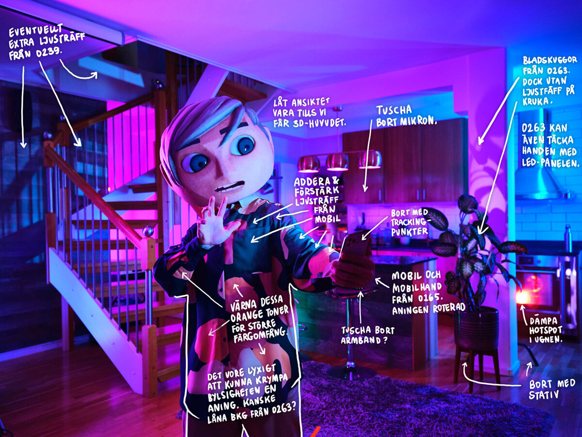
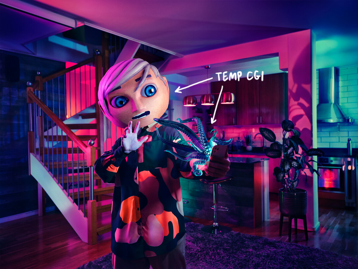
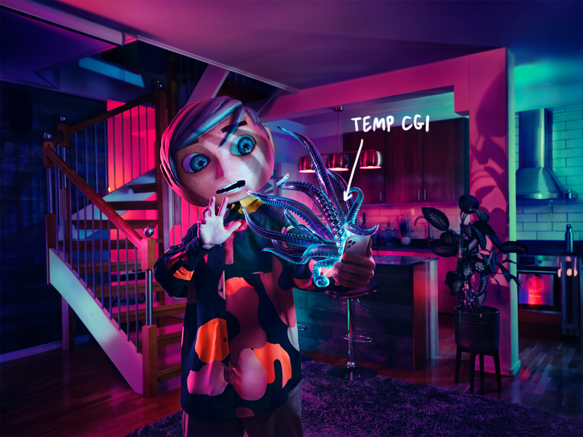
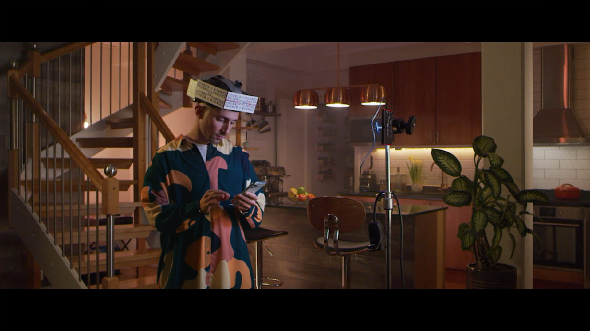
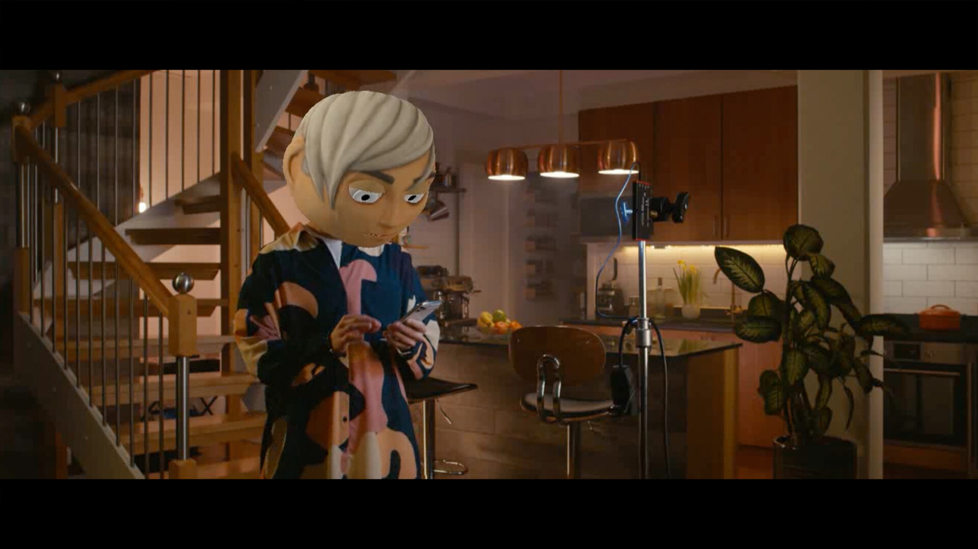
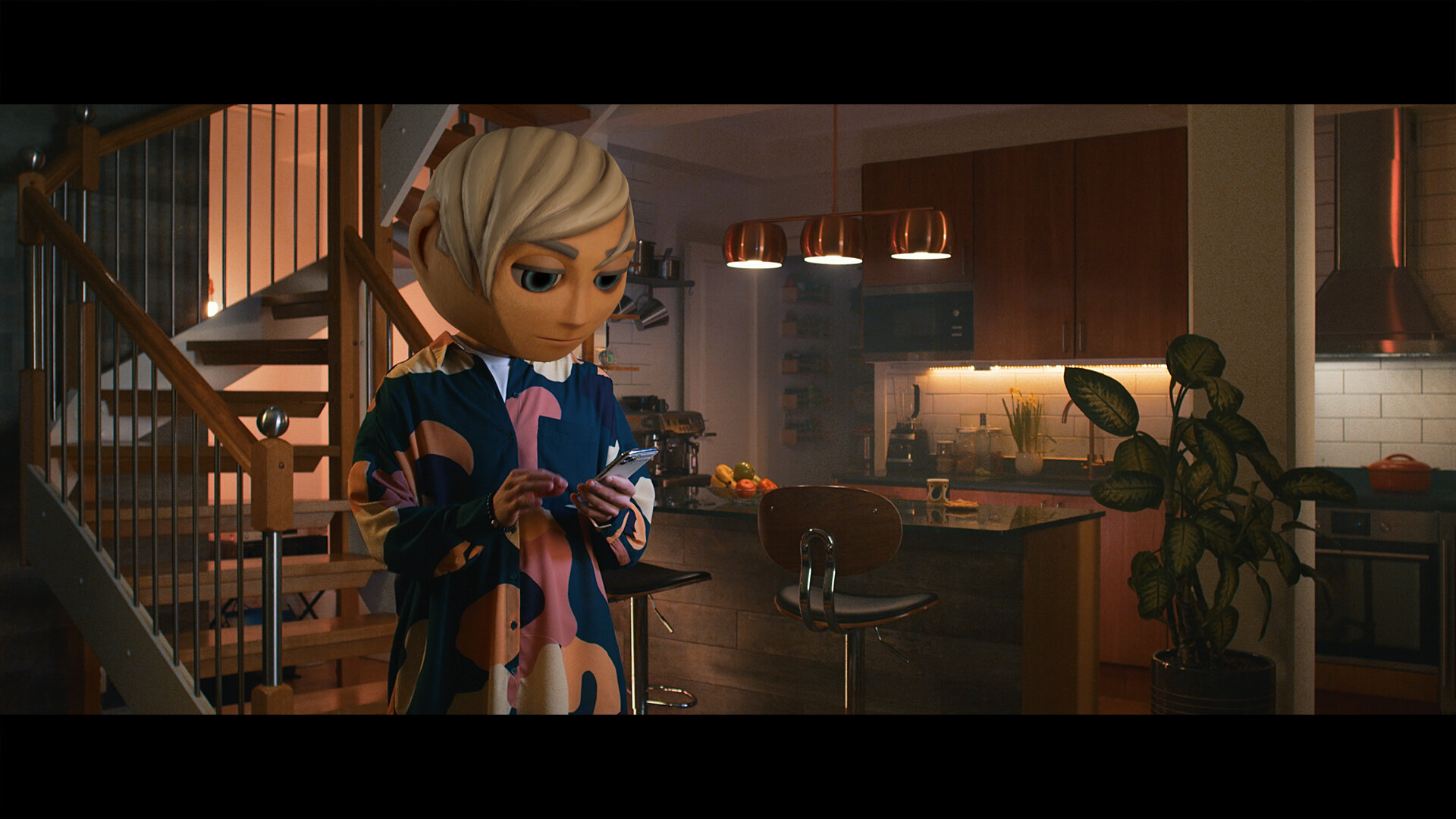
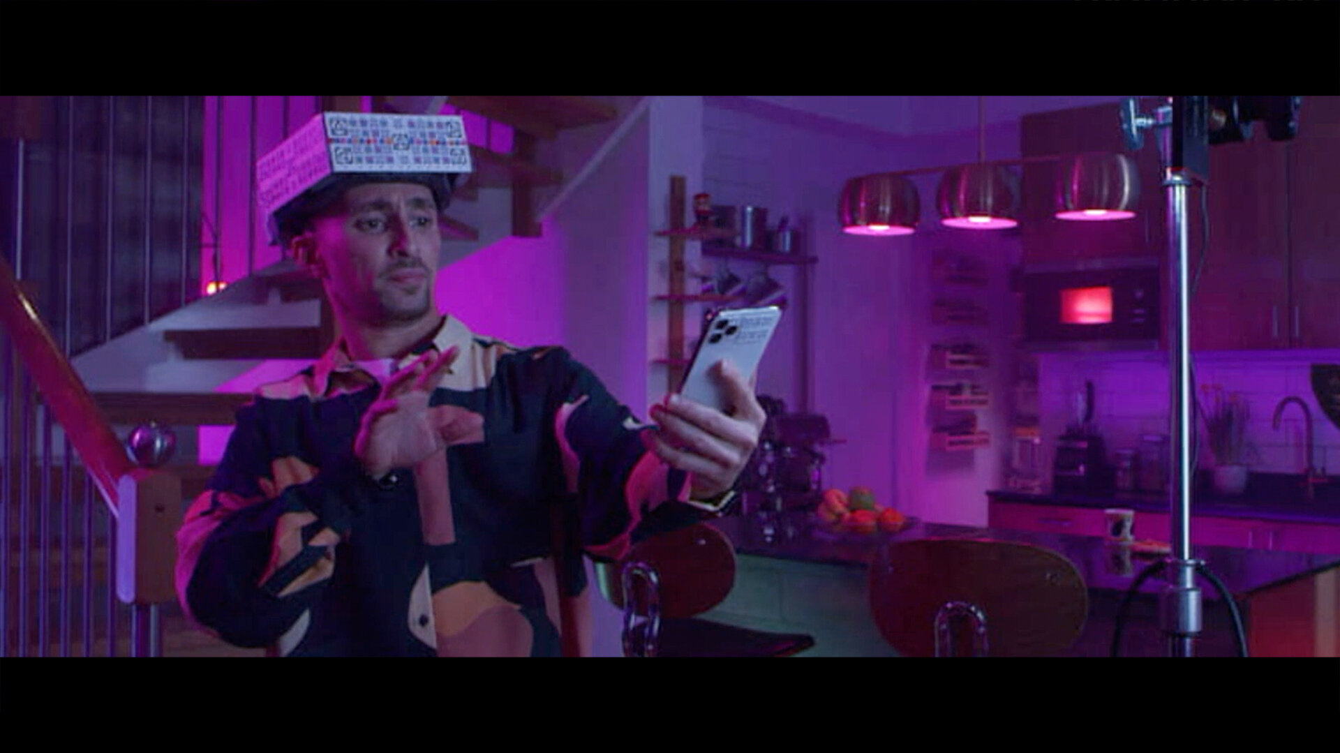
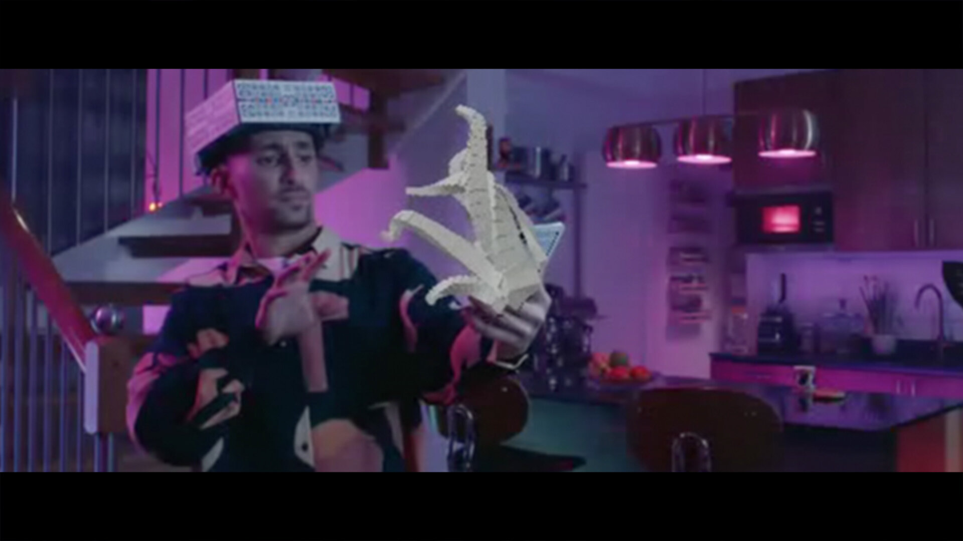
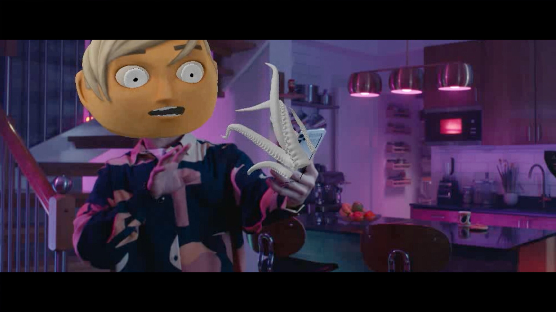
Below: Photo and TVC, step by step.
This is the first time ever we have used a CGI head. All other visuals and campaigns (incl the still photography for this campaign) have used the physical prop masks done by John Nolan Studio in 2016. However, for this campaign we were unable to tell the story with the static and neutral expression in the masks. Still, we were very careful to keep the stylized aesthetic that’s already in place (love those wonky teeth), and we stayed clear of having to show how the expression changes into the terrified and spooked look. The mask was 3D-scanned in the UK by Ten24.
Since we wouldn’t be able to use the key visual for sales-driven communication (not associated with Vimla Filter and invasophobia) we shot this backup photo of Michel comfortably enjoying an evening scroll. No special effects were used in this shot, it’s all practical in front of the camera.
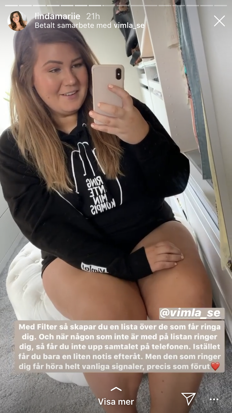
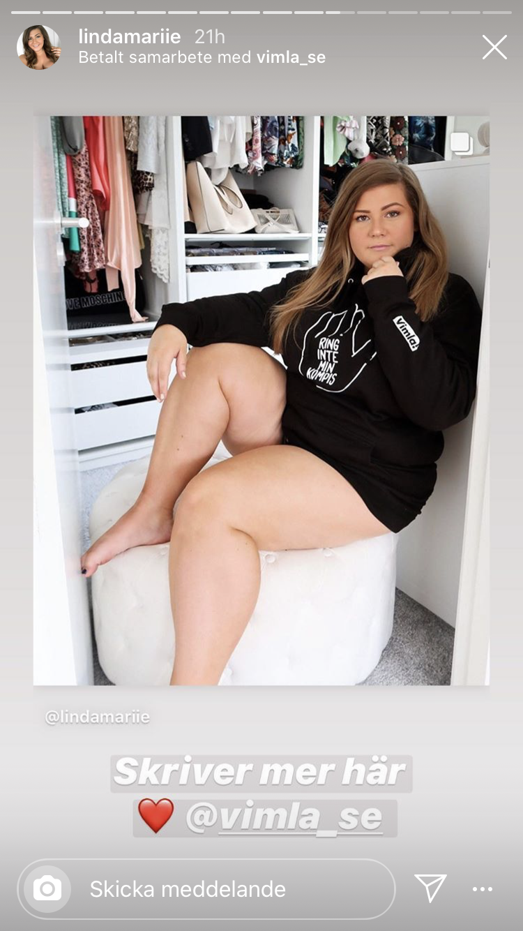
Giveaway spoofing the Swedish Rör inte min kompis (and the French Touche pas à mon pote) campaign.
Another t-shirt spoofing Experimental Jetset and their iconic John & Paul & Ringo & George shirt. My original design said Marimba instead of Incoming Calls but it was deemed too obscure for the general public. Probably a good call.
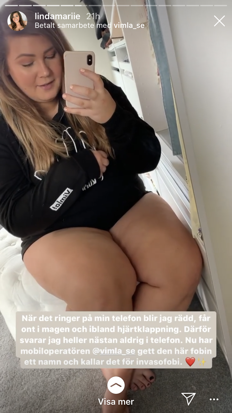
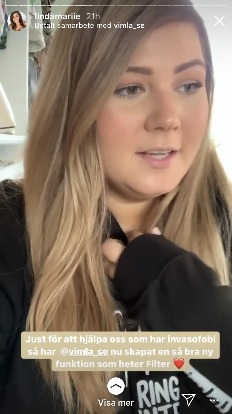
The app and phobia got a lot of editorial coverage and from comments in social media we could tell it captured the zeitgeist and resonated with the general public.
Expressen TV, May 29th 2020
Ångestpodden with Ida & Sofie, May 27th 2020
Ångestpodden, May 27th 2020
expressen.se May 19th 2020
Opinionated comments on Expressen’s Instagram.
Lots and lots of appreciation in the comments on Linda-Marie Nilsson’s Instagram post.
