A peek behind the scenes
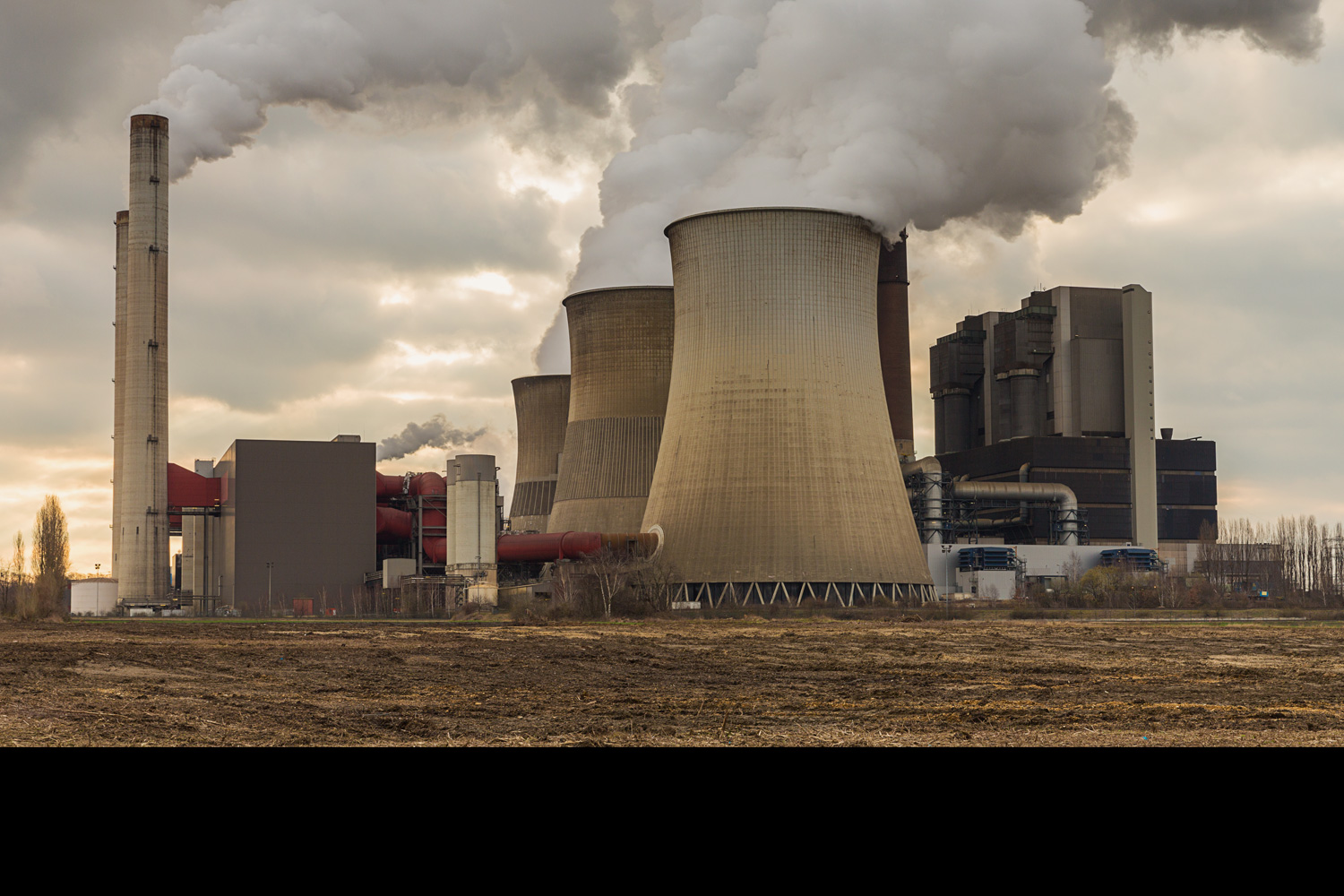
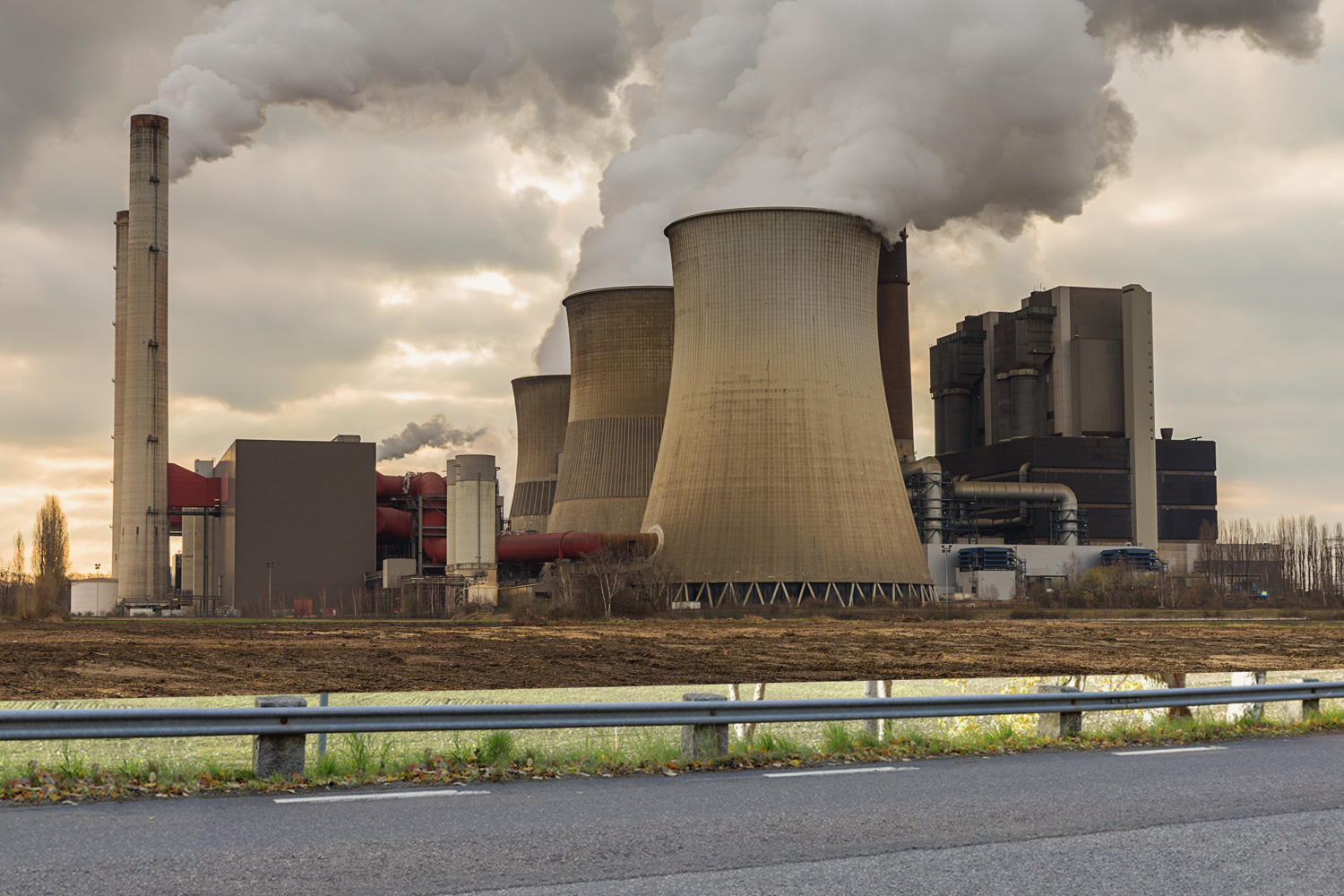
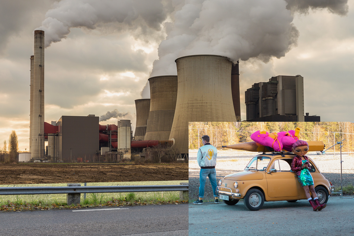
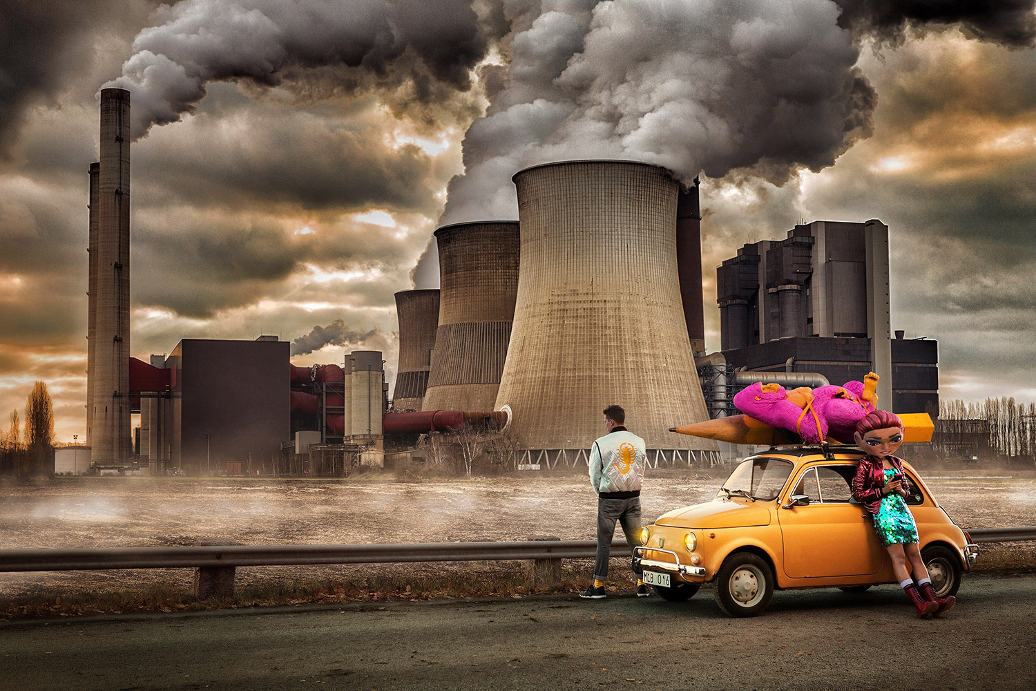
The ambition was to find an actual location that delivered at least 60 % of the doom and gloom we had in mind, and to enhance that in 2D or 3D. We were however unable to secure such a site so the commercial and still photography became composites where we shot the characters and the car on site and then added the power plant(s) in post.
Below is an early animatic we did a week or so before the shoot to get a better grasp of the timing and to see if the story was clear enough in the 15 second format we were aiming for. We’d been location scouting prior to this and the hedge and road that’s used is from the actual location. By now we also knew that we’d use stock video as a background element.
In the animatic I fooled myself a bit in how bright and colorful the interior could be and still maintain continuity with the exterior shot. But everything else is pretty much spot on. Even the guy who played the buddy ended up looking more or less like the drawing I did.
I took great pleasure in styling Diana and her buddy. We all loved the sequin dress but it was tricky to figure out how to add attitude and not having her look like she’s on her way to a wedding. In the end, the boots and having her balancing on her heels made all the difference and steered the image in the right direction. See roughs and final art higher up.
For the guy we got a jacket just like the one Ryan Gosling wears in Drive. A fun easter egg for the ones who pick up on it and something that adds both eye candy and a bit of drama to the visual.
As always, the commercial needed to work in a gazillion different crops and time formats – with and without price tags – and apart from the traditional 16:9 I’m quite fond of the vertical split screens we did for Instagram Stories and DOOH (Digital Out Of Home). We also did a bunch of horizontal split screens that worked quite well. Below is the storyboard rough (from when we were hoping to find a flying elephant and a Trabant 601) and the final clip.


